Language: Non-engineer
You know that “visualizer” button that you can sometimes find on an audio player which, when pressed, opens up a window that shows trippy shapes or waves that seem to move and morph with the music? If I have failed to describe it, then I am sure you have seen it before – here is an example:
This example is from iTunes, which has had this functionality for as long as I can remember when I first used it in ~2004. Yet, even my preferred music service, Spotify, had this functionality back when they made an attempt at Spotify Apps – a program and API that was discontinued in 2014. So why do media players include this weird visualizing feature? Well, most of the time it’s simply for entertainment. Now, if you let the curiosity flow, you’ll wonder how it listens and reacts to music. Does it know the exact moment when vocals come in or the bass drops before they actually happen? Absolutely not, it’s far dumber software than that. Let’s discuss.
What the hell is this thing and how does it do that?
A brief explanation of the frequency spectrum
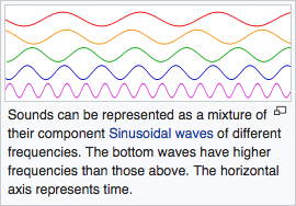
The frequency spectrum and its domain have great applications in all fields of applied physics, but we are not here to talk all day about it. So, let’s just stick to talking about music and sound. To put it simply, sound waves can be represented by these wavy math functions called sine functions. These waves change as time goes on and the sine function’s frequency determines how fast they change with time. So, a sound wave is actually multiple sine waves at varying frequencies put together. Wikipedia has a great picture to help visualize this:
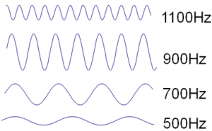
The frequencies of the sine waves that make up a sound wave determine the pitch of the sound you hear. So, for this discussion, just know that the higher the frequency, the higher the pitch. For example, the sound of a screaming baby has a higher frequency than the sound of the bass thumping in your car. So, the sine waves that make up the sound of the screaming will be generally higher frequency than the sine waves that make up the sound of the bass thump.
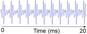
We can understand what kind of sine waves are present in a sound by examining its frequency spectrum. Frequency analysis used to break down a sound to see its frequency spectrum. Additionally, not only do we see which frequencies, but we also see how much the same frequency is used for the duration of the sound. So, a sound that looks like this:
May give us the following graph of the frequency spectrum:
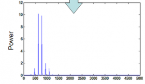
So, on the bottom of the above chart, we can see the frequency of the sine wave heard. The higher the blue peak, the more often a sine wave of that frequency was heard during the 20 millisecond sound in the first picture.
Here is a fun tool by Academo to help process what we just learned (make sure to check the ‘Sound On’ box once you get there): An interactive Wave Interference and Beat Frequency Tool by Academo
Back to the point
So, visualizers are just aminations and effects that use volume and the frequency spectrum to alter predetermined elements of their current visual state. To explain one of these systems by scenario, say we make an embarrassingly simple audio visualizer that starts as a 1 by 1 by 1 meter green cube on the user’s screen. Then, the system listens to the audio in 1 millisecond chunks, performs spectrum analysis on that chunk, and looks for our desired information. So, if we see a spike in the 20-40Hz range, then we know there was a bass thump in the audio and we could make the cube jiggle a little bit. Additionally, as the volume of the audio increases, the hue of the cube could change slightly with each increase of a couple decibels. That’s it, that jiggly cube is a simplified version of the system we saw in the introduction video. Even though most audio visualizers are cooler looking than a 1 meter cube of jello, they both boil down to using the same essential tools.
Let’s get physical
So, for a side project, I wanted to make the visualization handled by hardware. Using the lessons we just discussed, I developed software using a tool called Processing to perform real-time spectrum analysis on whatever audio my laptop’s microphone was hearing. In the white window open on my laptop in the video below, we can see this real-time frequency analysis:
The black spiking you saw in the white window represents the same concept that we saw represented by this picture:
Yet, instead of representing one 20 millisecond sample like the photo above, the window in the video is showing a new graph every 1 millisecond. So, because the song in the video is longer than 1 millisecond, the graph must change constantly to represent the frequencies it just found in the last 1 millisecond sample.
The frequency information shown on the graph was cut into 4 bands (0-5000,5001-10000,10001-15000,15001-20000Hz) and the average peak value was calculated for each band. Those 4 values were communicated to an Arduino every time a new graph was made. That Arduino then ran columns of LED to symbolize the average peak value of each band. Finally, the result looks a little something like this:
I’m sorry for the awful video quality, but that video is from September 2015 when I built that hardware. The hardware has since been repurposed, so I sadly could not reshoot a video for this post. Regardless, pretty neat, huh?
Language: Engineer
Objectives
Visualize the magnitude of adjustable frequency bands present in an audio signal excitation.
Visualization must be in real-time.
Visualization of the magnitude is to be done by LEDs in a 2d matrix.
How it was done
I used Processing‘s native Fast Fourier Transform algorithm to decompose my laptop’s microphone audio into its FFT representation at a sample rate of about 1 kHz. Then, chopped the audible range of the FFT into 4 bands and calculated the average magnitude within each band. In order to avoid handshaking, I used Arduino’s Firmata library to communicate the information from Processing and used the Arduino to drive the pins controlling two PWM ICs that ran the LEDs.